Light & Wonder's Product Ecosystem

Replace with hero image
Light & Wonder is a global leader in gaming technology — powering slot machines, casino management systems, and iGaming platforms used by millions of players worldwide. With multiple product teams building simultaneously across desktop, kiosk, and web surfaces, design inconsistency had become a genuine business problem.
Each product team had evolved its own component patterns, color usage, and interaction models in isolation. A button looked different in three products. A data table had four different implementations. A designer joining a new team had to relearn the system from scratch.
"Floret" was the name we gave the unified design language built to bring every Light & Wonder product under one coherent visual and interaction system — scalable, token-driven, and built entirely in Figma.
Each product team had built UI independently. Same elements — buttons, inputs, modals — looked and behaved differently across apps, breaking the sense of a unified brand.
Designers duplicated components across files, leading to version drift. A fix in one file never propagated elsewhere. Teams routinely shipped different versions of the "same" component.
Without shared tokens or component specs, every handoff required custom annotation. Engineers re-implemented the same UI patterns repeatedly with no shared code reference.
With new products being greenlit quarterly, onboarding designers took weeks. There was no foundation to build on — every new product started at zero.
Floret system overview — the full component library in Figma
Rather than building a library of pretty components, we started with the architecture — the rules, relationships, and constraints that would make the system trustworthy, scalable, and easy to contribute to.
Floret was structured in three layers: Foundations (tokens, grid, motion), Components (atoms through organisms), and Patterns (documented recipes for common UI scenarios). Each layer built entirely on the one below it.
The entire system was driven by Figma's Design Variables — a three-tier token architecture that separated raw values from their semantic meaning, enabling theming, dark mode, and white-labelling from day one.
Raw, named values — every colour, size, radius, and duration that exists in the system. These are never used directly in components.
Tokens named by intent, not value. Reference primitives. Swapping a theme only requires re-mapping semantic tokens — no component changes needed.
Scoped to a single component. Reference semantic tokens. Allow component-level customisation without breaking the global system.
240+ colour tokens across 12 scales. Brand, neutral, feedback, data-viz, and surface palettes. Every combination passes WCAG AA.
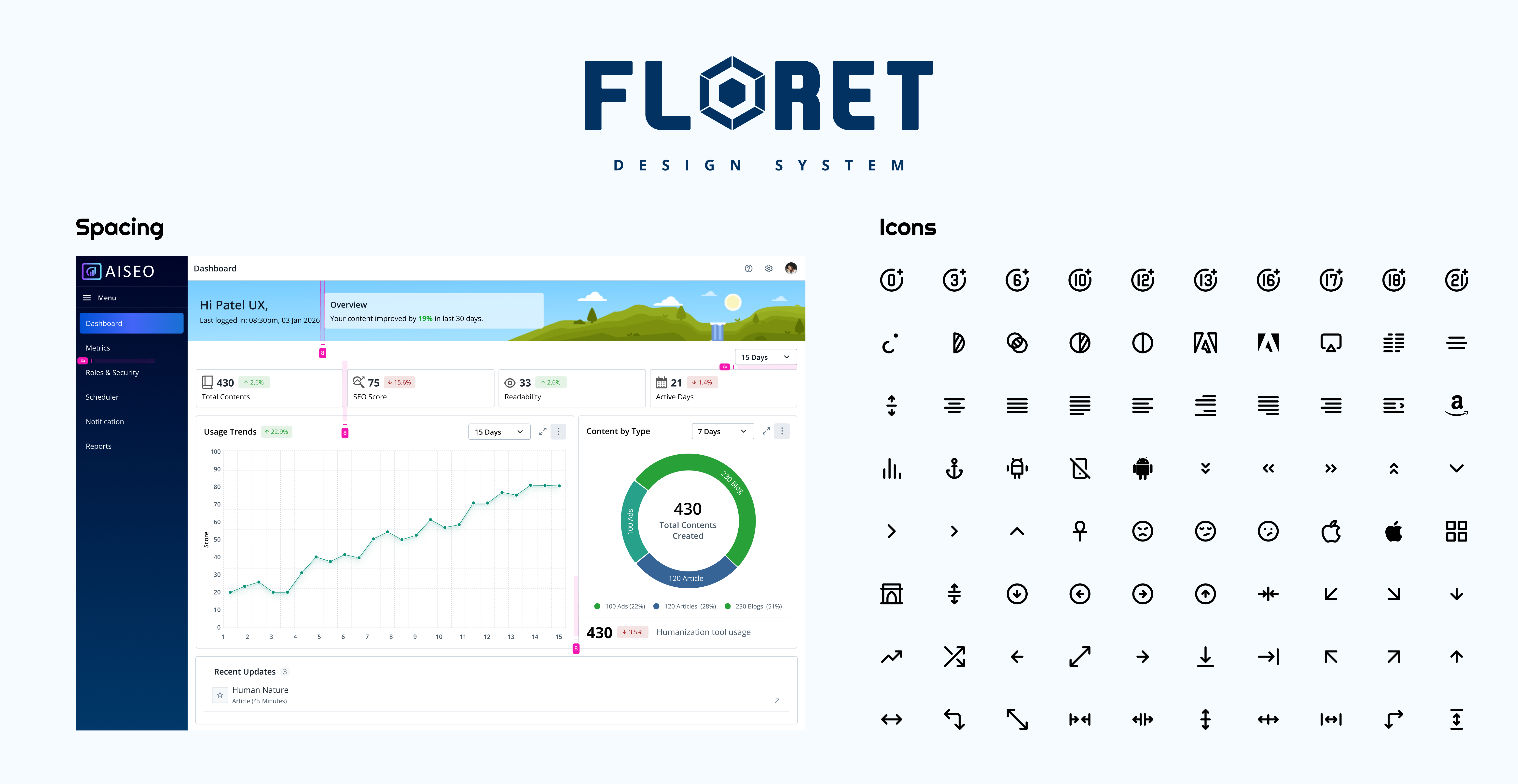
4px base grid with 12 named steps (2px → 96px). Separate scales for layout spacing, component padding, and icon sizing.
Font size, line-height, letter-spacing, and font-weight — all tokenised. 9-step type scale with display, body, label, and code stacks.
Duration tokens (instant, fast, moderate, slow) and easing curves (ease-in, ease-out, spring) — ensuring consistent animation feel across all products.
6 radius tokens from none to full (pill). Each mapped to semantic names so a design direction shift only requires updating one variable.
Dark, light, and high-contrast modes all live within the token system. Switching modes requires zero component edits in Figma.
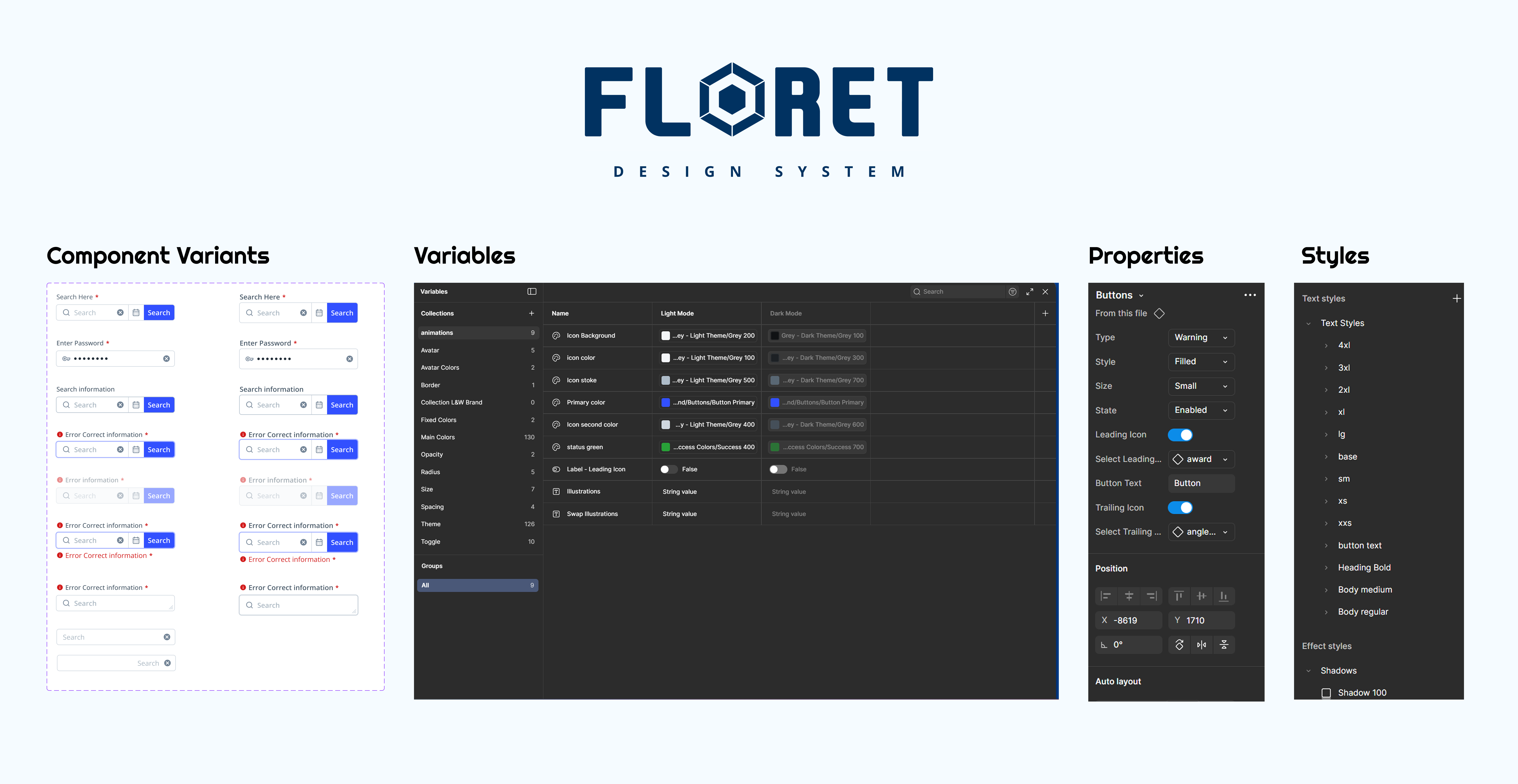
Figma Variables panel — three-tier token architecture with mode switching
Every component in Floret was built with Figma Auto Layout from the ground up — not retrofitted. This wasn't just a cleanliness preference; it was a rule that enforced real-world responsive behaviour directly in the design tool.
The goal was that a designer using any Floret component should never need to manually resize or reposition child elements. The component responds — just like a real coded implementation would.
Components use "hug contents" by default. Containers use "fill container." Never fixed widths unless absolutely required — matching how CSS flexbox and grid behave in production.
Complex components like data tables, form groups, and navigation bars were built with deeply nested auto layout frames — ensuring every element stayed in sync when content changed.
All padding and gap values inside Auto Layout frames reference spacing tokens directly — no hardcoded numbers. Changing space/md updates every component that uses it instantly.
Stack-on-mobile logic was baked into components using Figma's min/max width constraints alongside auto layout — so breakpoint behaviour was visible in the design file itself.
Every component was documented with usage guidelines, dos & don'ts, accessibility notes, and a direct link to the Figma frame — making the library usable as both a design tool and a reference document.
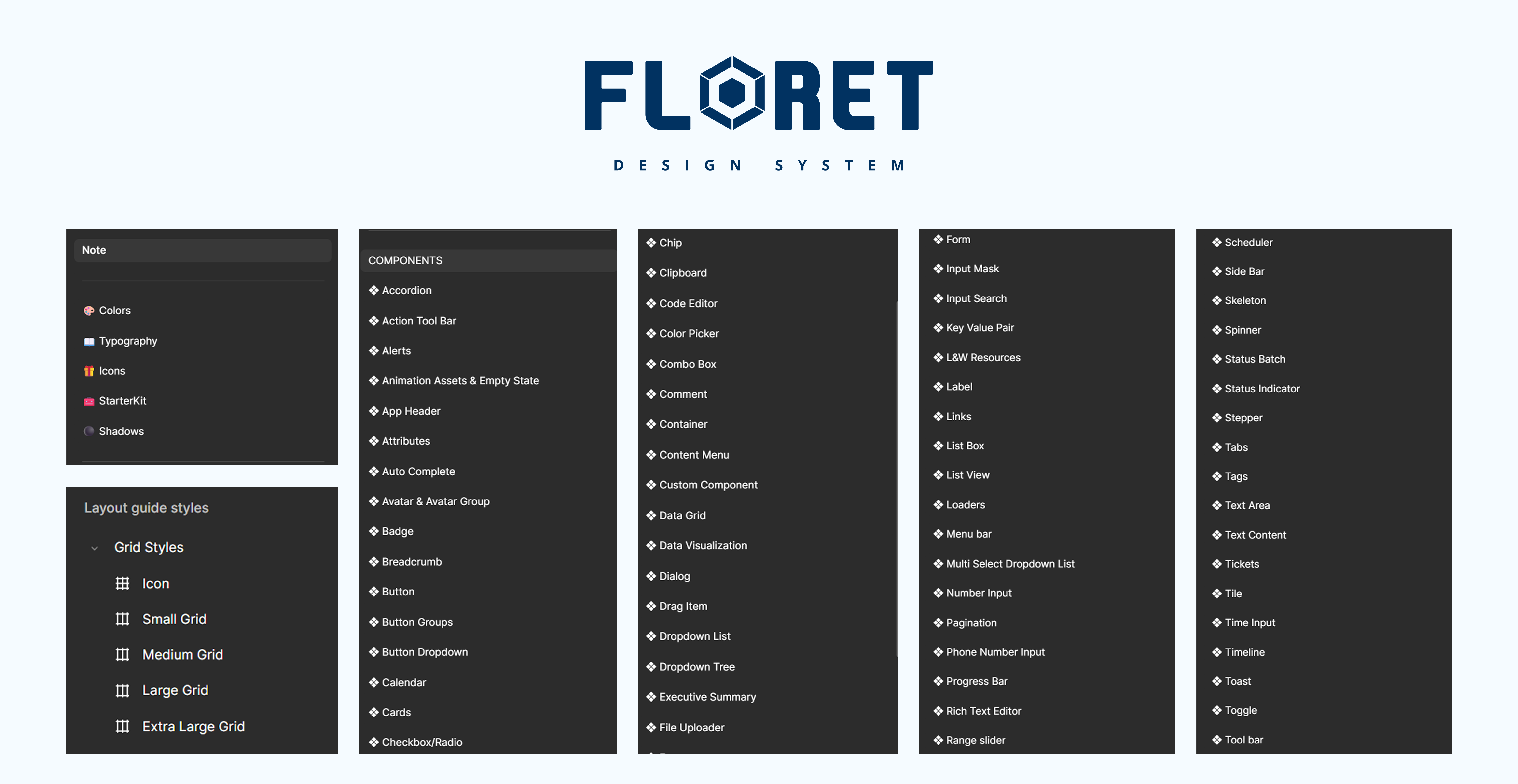
Component library — all 96 components laid out in the Figma master file
One of the biggest hidden costs in design systems is the incomplete component — the one that looks fine in the default state but falls apart the moment a designer needs an error state, a loading state, or a disabled variant. Floret was built with completeness as a hard requirement.
Every interactive component shipped with a full matrix of variants and states before it was published to the library. This was non-negotiable.
Floret was designed to serve every Light & Wonder product — from internal casino management tools to player-facing iGaming interfaces — without any product feeling like a poor fit.
Data-dense admin interface requiring compact density, advanced data tables, and complex filter panels. Floret's component density variants and data table organism covered this out of the box.
Consumer-facing web app with a premium, game-like aesthetic. Floret's theming system let this product use a bold brand palette while sharing the exact same component codebase.
Touch-first, large-format display requiring oversized tap targets and high-contrast visuals. Floret's size scale and high-contrast theme mode handled both without custom component builds.
Business intelligence tool for L&W operations teams. Required data visualisation support and report-style layouts. Floret's page header, tab group, and stat card patterns accelerated delivery by 60%.
A design system is only as good as its governance model. Without clear contribution rules, review processes, and deprecation policies, systems decay into the same fragmented mess they were created to replace.
We defined a lightweight governance model that made it easy for any designer to propose changes — while keeping the core team accountable for quality and coherence.
Any designer on any product team could propose a new component or token via a structured Figma template. Proposals included use-case rationale, accessibility notes, and at least two real product examples.
Weekly 30-minute system review sessions. Proposals reviewed against existing patterns for redundancy, token compliance, and visual consistency before approval.
Floret followed semantic versioning (major.minor.patch). Breaking changes required a migration guide. Each release was announced in a shared Confluence changelog.
Components slated for removal were marked deprecated for two release cycles, giving product teams time to migrate. No silent deletions.
Every component had a Confluence page with usage guidelines, dos & don'ts, accessibility requirements, and annotated Figma links. Documentation was a release requirement — not an afterthought.
Designers assembled new screens using existing components instead of building from scratch.
Shared token names and component specs eliminated most annotation back-and-forth.
The same Button that existed in 4 different codebases is now one shared Figma source.
All four products now share the same spacing, type, colour, and interaction patterns.
Tokens before components. The temptation is to start building buttons and inputs. Resist it. Spend the time on your token architecture first — it's the foundation everything else inherits.
Completeness compounds. A component with all its states defined once saves hours of "what should happen here?" conversations for every future designer who touches it.
Auto Layout is non-negotiable. Components built without it are fragile, don't represent real behaviour, and slow down designers instead of helping them.
Systems need maintainers, not just builders. The governance model we put in place was just as important as the components themselves. Without it, even a great system goes stale.