UI Design System
Replace with 1.png
BuyerAssist is a B2B SaaS platform that helps enterprise sales teams guide buyers through complex purchasing decisions — reducing deal cycles and increasing close rates.
Version 1.0 had grown organically over two years, resulting in an inconsistent UI, fragmented component library, and a steep learning curve for new users. The goal of 2.0 was a full design system overhaul from the ground up.
How might we compress sales friction, symbols, and complexity to make the platform usable without the time or cognitive overhead?
Over 40+ button variants, 3 different modal styles, and zero shared spacing scale across the product.
New users required 3+ hours of training before becoming productive. Drop-off during trial was 68%.
Designs lived in scattered Sketch files with no tokens, annotations, or component documentation.
Color contrast failed WCAG AA in 60% of screens. No keyboard navigation support existed.
We conducted 12 user interviews across sales reps, managers, and buyers. Sessions were 45 minutes each, mixing contextual inquiry with task-based usability tests on the existing product.
Semantic color system with 5 scales (primary, neutral, success, warning, error), each with 10 stops. All pairs pass WCAG AA.
8-step type scale built on a 1.25 modular ratio. Separate display, body, and mono stacks with line-height and letter-spacing tokens.
4px base grid with a T-shirt sizing alias system (xs→3xl). 12-column responsive grid with defined breakpoints at 375, 768, 1024, 1440.
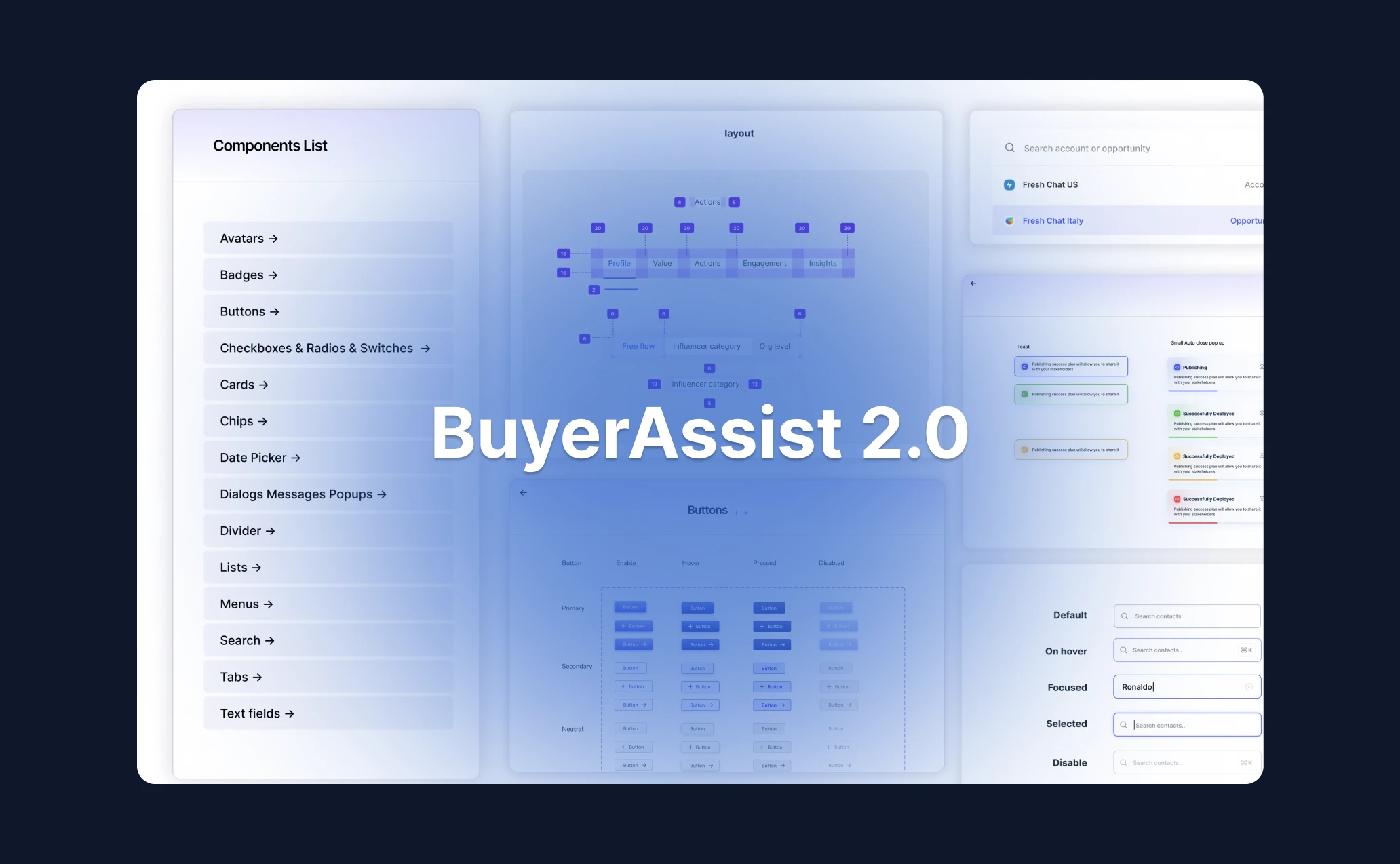
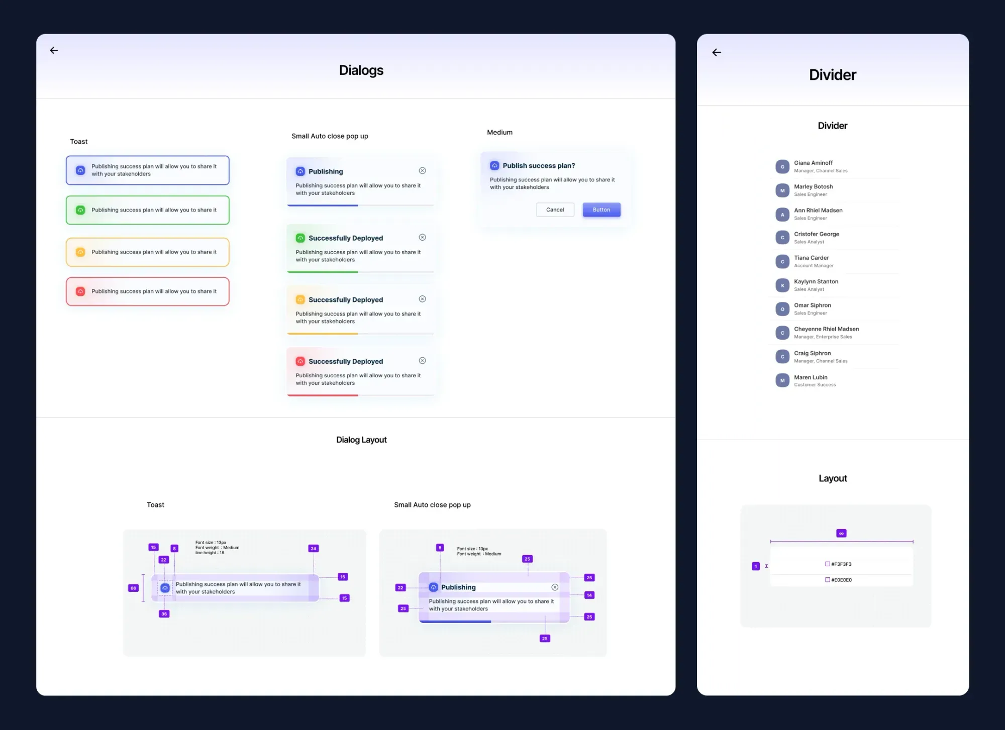
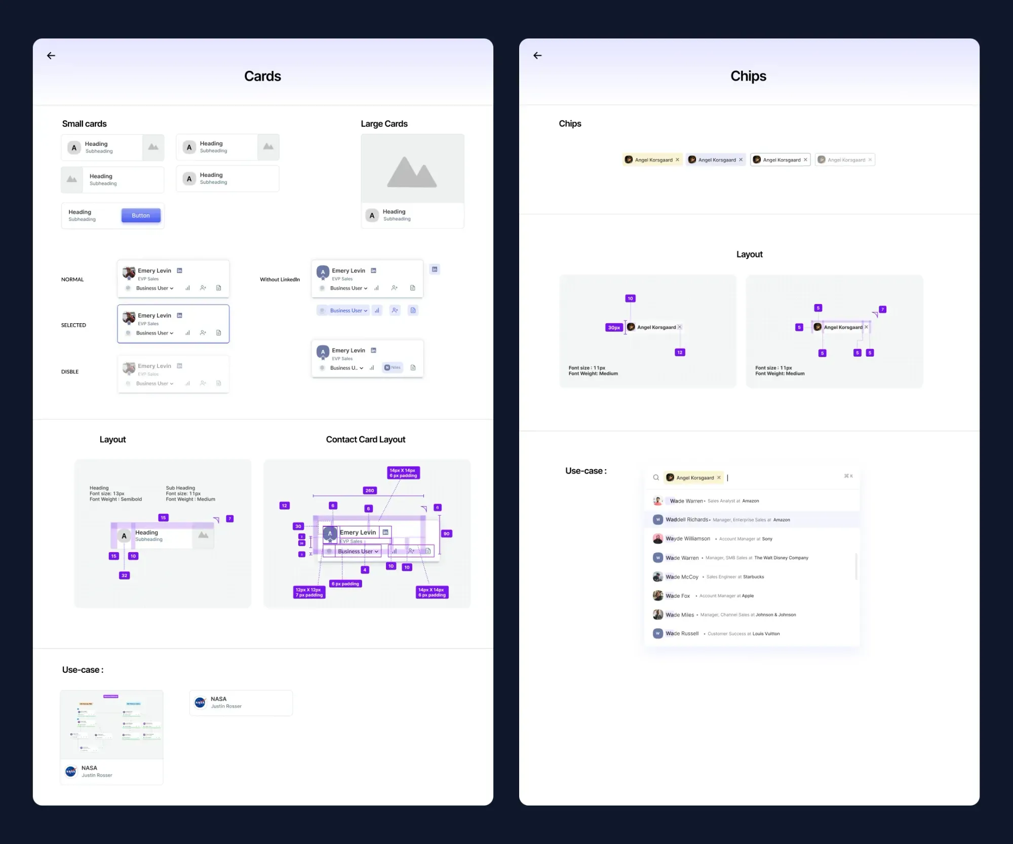
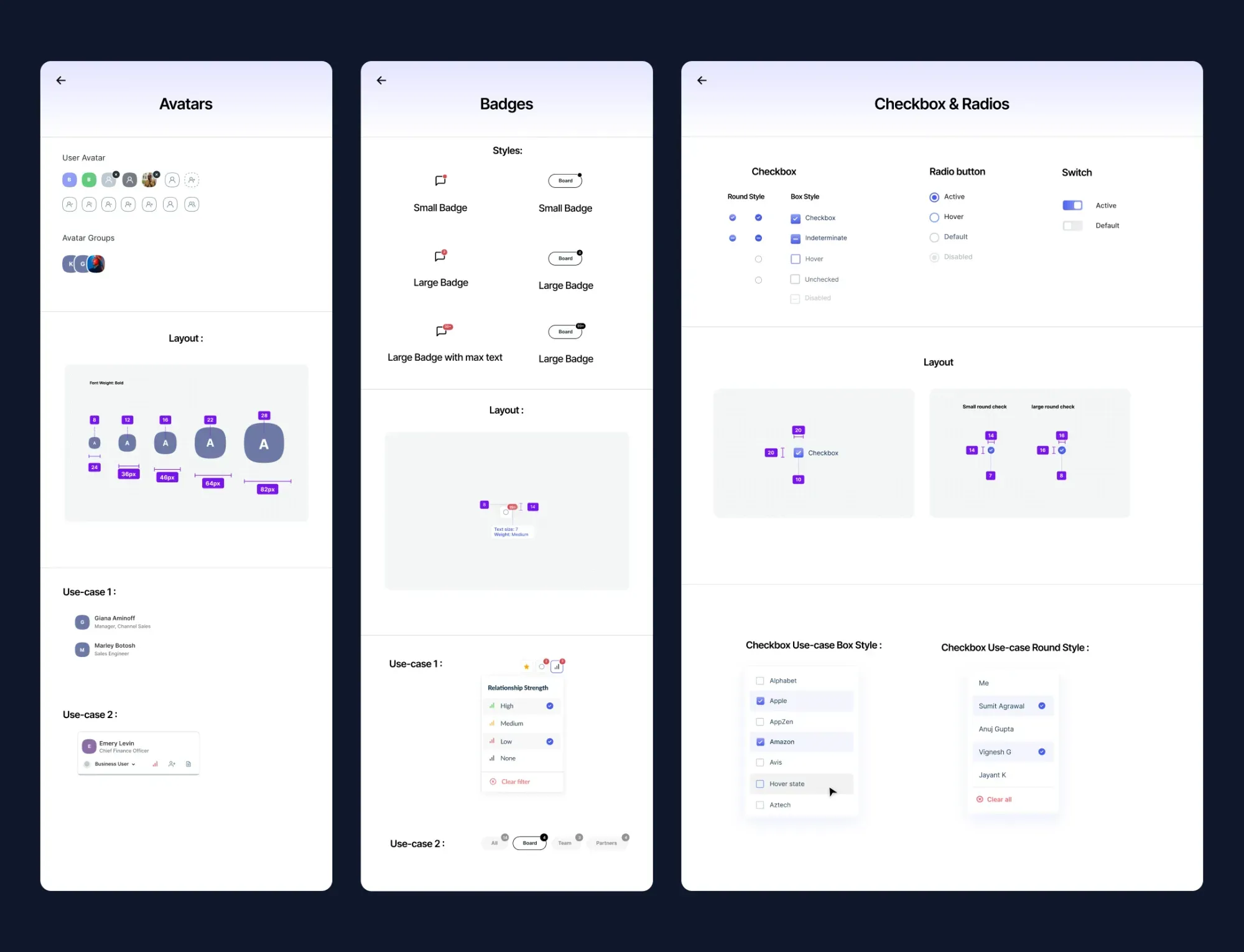
82 base components, each with 4–6 states and full variant coverage. Documented in Storybook with usage guidelines.
Easing curves, duration tokens, and reduced-motion support baked into every animated component from day one.
Focus rings, ARIA roles, keyboard nav, and color-blind-safe palettes built in — not bolted on.
Catalogued every UI element across 120+ screens. Identified 312 unique components that could be consolidated into 82.
Defined a three-tier token system: primitive → semantic → component. Enabled dark mode and white-label theming from day one.
Built components in Figma using Auto Layout, variants, and interactive states. Each component had a paired Storybook story.
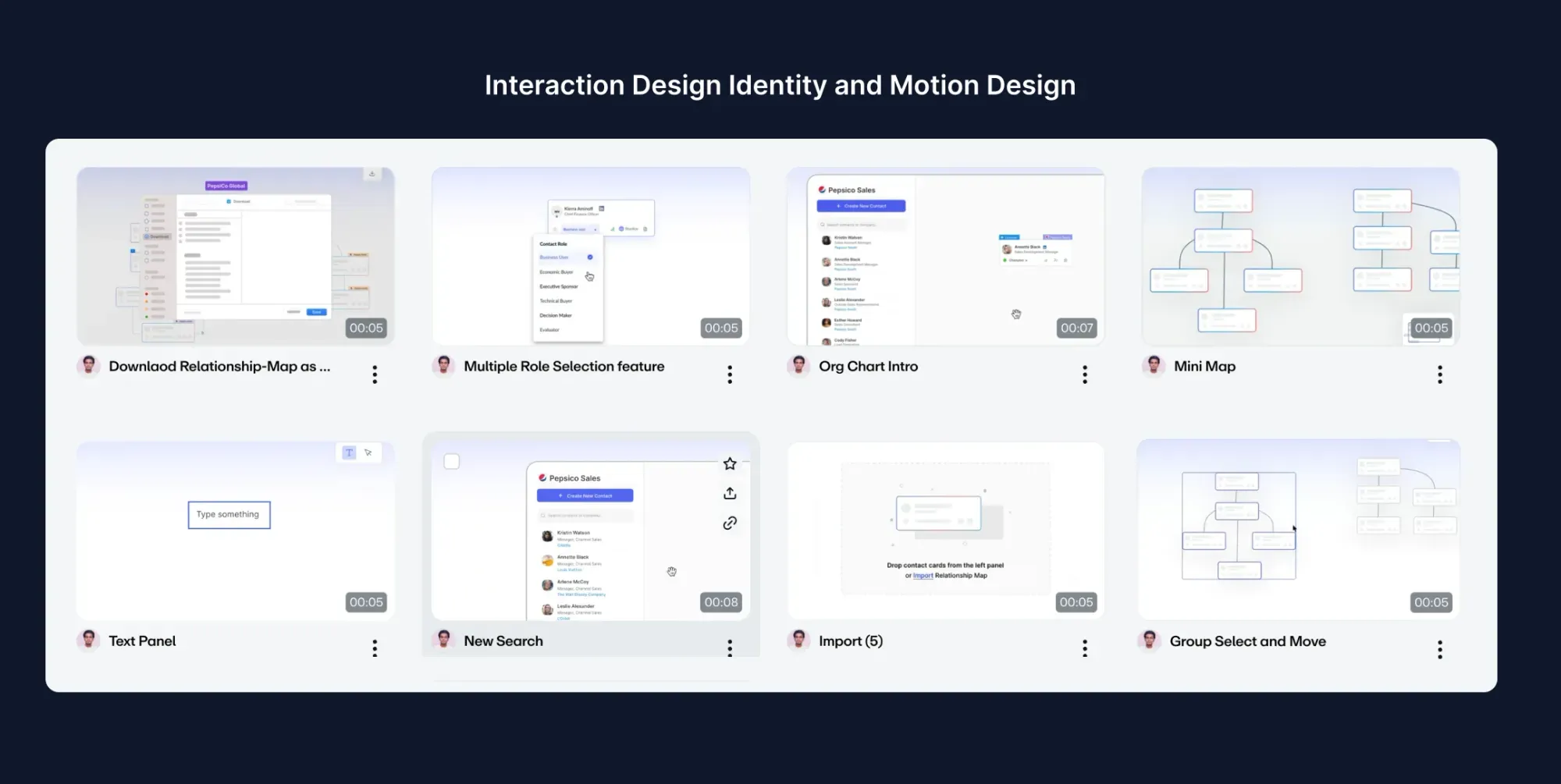
Redesigned all 120+ screens using the new system. Ran usability tests at mid-fidelity before moving to hi-fi.
Used Figma's inspect panel + custom annotations. Worked directly with engineers in two-week sprints throughout implementation.
New users became productive in under 90 minutes vs 3+ hours previously.
Drop-off during free trial fell from 68% to 37% within the first quarter post-launch.
Shared token system and component docs eliminated most back-and-forth.
All screens passed contrast, keyboard, and screen-reader audits on first QA pass.