The Adidas SS23 Sell-In Catalogue is a B2B web platform built for the India retail market. It gives authorised retailers — multi-brand outlets, franchise partners, and key accounts — a dedicated digital channel to browse the full Adidas seasonal range, review products, and submit bulk orders for the upcoming season.
Before this product existed, the sell-in process was entirely offline. Sales representatives would visit retail buyers with physical catalogues and printed order sheets. Buyers would manually write down article numbers, quantities, and size breakdowns. Those sheets would then be re-entered into internal systems by the sales team — a slow, error-prone, and completely unscalable process.
The core challenge: How do we give retailers a self-service buying experience that mirrors the confidence of an in-person showroom visit — while capturing bulk order data accurately, exportable, and without a sales rep in the room?
Adidas India printed seasonal catalogues for each product category — Footwear, Apparel, Accessories — and distributed physical copies to field sales reps before each sell-in season.
Sales reps would physically visit each retail buyer — sometimes travelling across cities — to walk through the catalogue page by page and take note of products the retailer wanted to stock.
Buyers would write down article numbers, colour choices, size run preferences, and bulk quantities on paper order forms. No validation. No product imagery at point of entry.
Sales reps collected the sheets and re-typed each order into internal SAP systems. A single retailer visit could result in hundreds of line items — all entered manually, all prone to transcription errors.
Neither the retailer nor the Adidas team had live visibility into what was selected. Changes required callbacks, revised sheets, and another round of re-entry. The process could stretch across weeks.
Handwritten article codes were misread or transcribed incorrectly, leading to wrong products being ordered — discovered only at delivery.
Retailers couldn't browse or plan without a sales rep present. Key buyers found the process patronising and inefficient.
Aggregating orders from 200+ retailers across India took weeks. By the time all orders were compiled, the data was already partially stale.
Printed catalogues couldn't show multiple colourways, tech features, or related products. Buyers made decisions with limited information.
The platform was designed as a web application — accessible on both desktop and tablet — giving retailers a secure, brand-consistent interface to browse the full SS23 range, understand products in depth, build a selection basket, and export their completed order to Excel with a single click.
The design was deliberately structured around four distinct screens, each corresponding to a step in the buying journey — matching how buyers actually think and shop, not how internal Adidas systems were organised.
Secure retailer login with brand-forward entry screen — Adidas logo, seasonal branding, and clean credential fields. Sets the professional tone immediately.
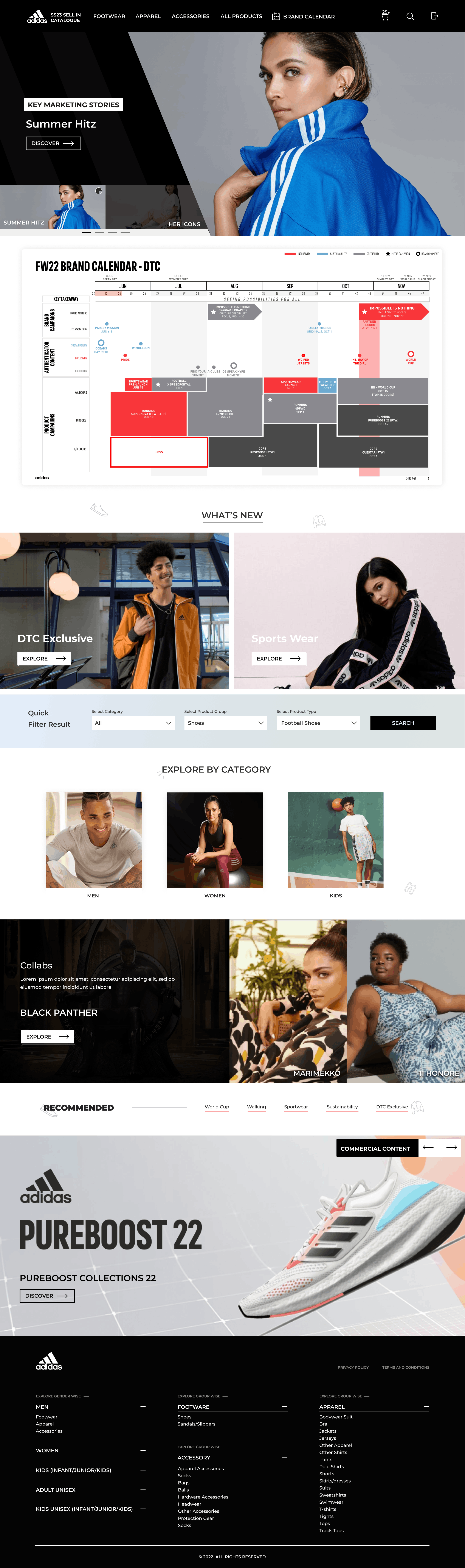
Seasonal hero banners, featured collections, brand calendar, "What's New" editorial, quick filter, and category browsing — a real retail discovery experience.
Full catalogue with advanced filtering — price range, division, gender, age group, retail intro month, categories, product group, and product type. Sortable grid with star-marked highlights.
Full product page with multi-image gallery, colourway selector, size-specific quantity input, bulk quantity presets (100, 500, 1000), custom quantity, and Add to Selection CTA.
A curated basket showing all selected products with price, quantity, and edit/delete actions — culminating in a one-click Export to Excel for order submission.
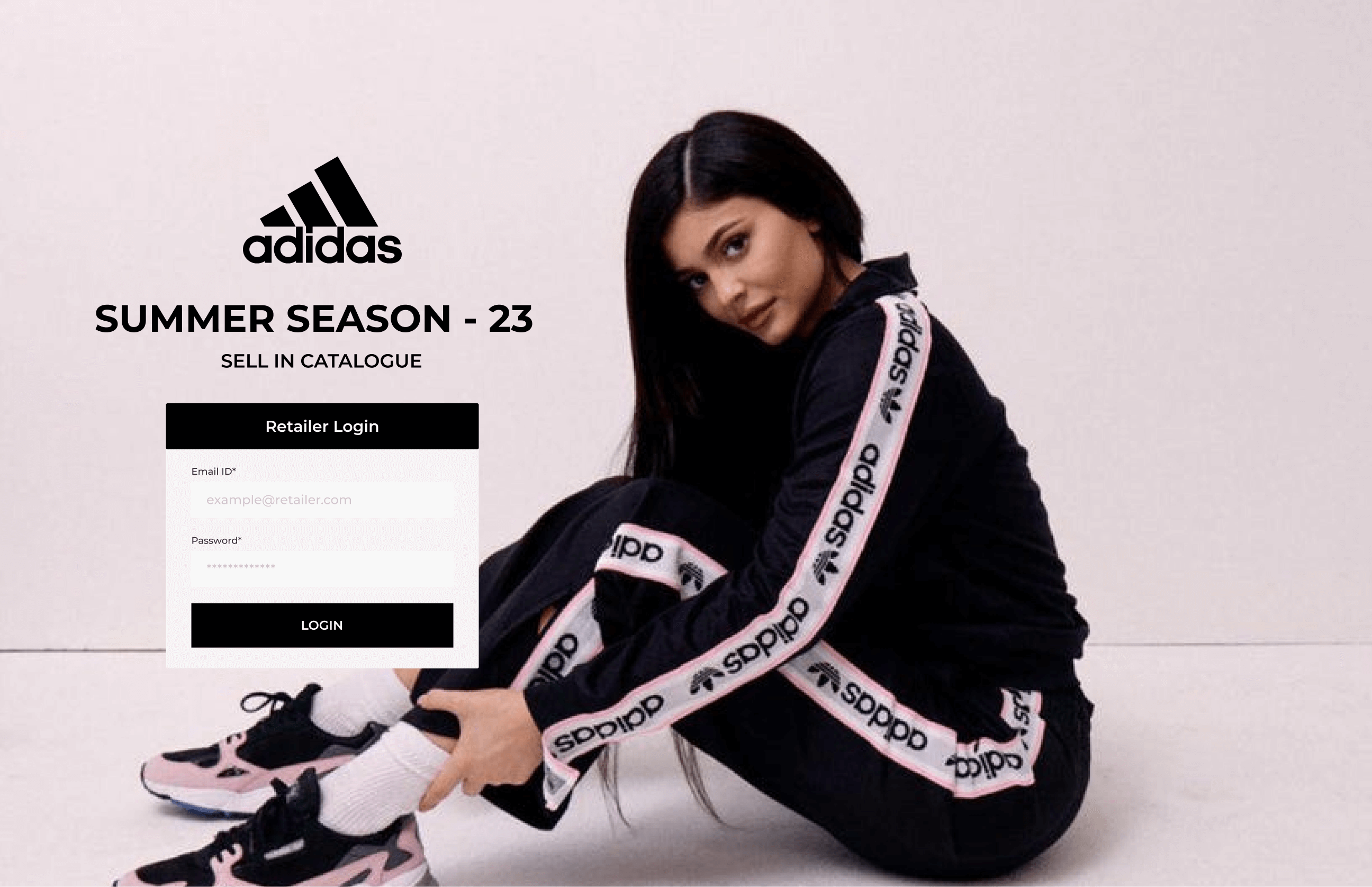
Login screen — retailer authentication with seasonal campaign imagery
Only authorised Adidas retail partners receive login credentials. The email ID field uses a retailer.com placeholder to reinforce this is a professional B2B tool, not a consumer store.
The full-bleed campaign image and large Adidas wordmark communicate seasonal identity before the buyer has even browsed a single product. Brand confidence starts at login.
"Summer Season – 23 / Sell In Catalogue" clearly communicates the context and scope of this session, preventing confusion across concurrent seasons.
Full-width hero carousel with campaign imagery highlighting seasonal narratives — Summer Hitz, Her Icons — giving buyers immediate brand context and editorial direction before they start filtering.
An integrated brand calendar shows retail launch windows, campaign timing, and product availability by month — allowing buyers to align their stock ordering with planned marketing moments.
Editorial panels for DTC Exclusive and Sports Wear stories sit alongside Men / Women / Kids category tiles — giving both story-first and category-first discovery paths.
A persistent quick filter bar — Category, Product Group, Product Type, Search — lets repeat buyers who know what they want skip discovery and go straight to results without scrolling the full catalogue.
Collab stories (Black Panther, Marimekko) highlight exclusive products with premium editorial treatment. The Recommended strip surfaces commercially important products by category tab — World Cup, Walking, Sporswear, Sustainability, DTC Exclusive.
Footwear, Apparel, Accessories, All Products, and Brand Calendar are always accessible — plus a cart icon with live item count (25), search, and sign-out. Everything the buyer needs, always one click away.
The entire UI uses Adidas's brand palette — primarily black, white, and light grey — with minimal accent colour. This isn't a creative choice; it's a brand compliance requirement. The product photography becomes the visual interest. A colourful UI would compete with the product images that buyers need to evaluate clearly.
Consumer e-commerce uses a single quantity spinner. B2B buyers think in runs of 100, 500, or 1000. Designing preset bulk buttons as primary interactive elements — not a dropdown or a field — reduced the cognitive load of ordering and made the most common actions the most visible ones.
Unlike consumer carts designed to be emptied quickly, the Sell-In cart is a working document that a buyer might return to across days. Edit and comment actions on every cart item treat the selection as a collaborative, revisable document — not a checkout queue.
Rather than building a complex order management backend for v1, the Excel export bridges digital and operational realities. Adidas's internal procurement teams already worked from Excel. The export file matched their existing column structures — meaning zero process change on their end while completely eliminating manual data entry.
B2B buyers iterate filters frequently — narrowing by price, then by gender, then removing a division. A persistent sidebar filter (vs. a modal or drawer) keeps all filter state visible at all times, reducing the cognitive overhead of remembering what's currently applied. "23 Results / Reset" in the filter header provides constant feedback.
Adidas's sales team had deep knowledge of which products were commercial priorities for each season. The star / "Highlighted Product" toggle surfaces that expertise digitally — giving buyers who trust Adidas's curation a faster, more confident path through a large catalogue without losing the freedom to browse independently.
Every retailer order now arrives as a structured Excel file. Zero re-entry by the sales team.
Aggregating all retailer orders went from weeks of data collection to same-day file processing.
Retailers can browse, select, and export orders without requiring a sales rep visit or call.
Article numbers, colourways, and quantities are captured digitally at source — no handwriting, no misreads.
B2B UX is not dumbed-down consumer UX. The buyers using this platform are professionals who know exactly what they want. The design needed to respect that expertise — fast access, real data, minimal friction — not hand-holding.
Meet the output format where it lives. By matching the Excel export columns to what Adidas's operations team already used, adoption was immediate. Designing for the downstream process — not just the screen — was the real unlock.
Brand constraints are a design brief, not a limitation. Working within Adidas's strict black-and-white brand system forced focus on layout, hierarchy, and information design. The result felt more premium than if we'd had full creative freedom.
The cart is the most important screen. All the discovery and product experience flows toward a single moment — the export. Making that screen trustworthy, editable, and clearly actionable was worth more design effort than any other screen.